The World Climate Service presents ensemble forecast maps as both anomaly forecasts and probability forecasts. Although the maps often look similar, there are important differences. In this article, we explain how the World Climate Service enables the interpretation of ensemble forecast models, how the maps are constructed, and the crucial differences between them. This information is very important for understanding long-range forecasts.
Probability Forecast vs. Anomaly Forecast: Ensembles
At the subseasonal forecast range (forecasts between three and six weeks into the future), ensemble forecast modeling is used. This means that the weather forecast model is run many times, with each “member” starting with slightly different values, to produce a range (hence ensemble) of forecasts. Because of “chaos theory”, ensemble members typically diverge (become different from other ensemble members) as the forecast steps forward in time. In fact, although the forecast in individual ensemble members can be quite different, they are each equally probable realizations of the possible future weather.
The ensemble modeling rationale is that we cannot know the initial conditions of the atmosphere at all locations around the world. To account for this initial uncertainty, the weather forecast model is set with multiple starting patterns, each with slightly different initial conditions. In this way, the model is able to produce a range of forecasts more closely aligned with the range of possible outcomes in the real world. For simplicity, it is often useful to express the forecast for a specific location as one number – an average of all of the members (51 in the case of ECMWF).
Probability Forecast vs. Anomaly Forecast: Ensemble Averaging
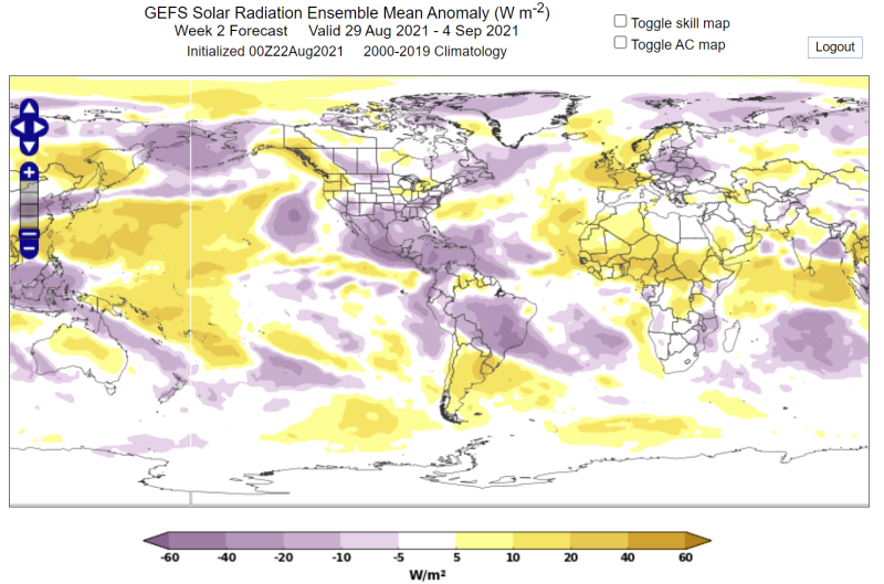
The ensemble average is often used to express the forecast. Each forecast of temperature (or wind speed etc.) is averaged to give a single value at each point on the Earth’s surface. Often this value is then subtracted from a climatological average (or normal) to produce an anomaly. Anomalies are useful as very often we are interested in how unusual the weather is; how much warmer or colder, wetter or drier, will it be compared to normal.
As useful as they are, anomaly maps do not give us the full picture; they tell us nothing about the range of possibilities and their associated likelihood of occurrence. They don’t tell us the probability of a warmer than normal day or week.
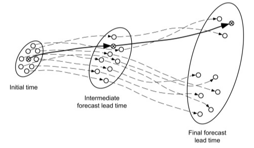
From Statistical Methods in the Atmospheric Sciences, Wilks, 2011.
For example, a forecast ensemble average anomaly of +1 could be made up of 51 forecasts close to +1, or alternatively, it could be made up of 40 forecasts slightly below zero and 11 forecasts well above +1. By considering only the ensemble average, we will be unaware of how likely the anomaly is, and how likely it is that something else could happen – in other words, potentially valuable information is missed.
A GEFS solar anomaly map for a week in September – each location has one value.
Probability Forecast vs. Anomaly Forecast: Probability Forecasts
At the WCS, each set of ensemble forecasts is carefully calibrated to ensure the range of possible forecasts produced by the model matches that seen in the real world. Once this is done, the forecasts are categorized in terciles, i.e., the lower one-third (33.3 percent), the middle third, and the top third of the climatological range. The terciles represent three possible future weather or climate condition outcomes: below normal, near normal, and above normal.
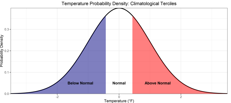
Now large forecast outliers contribute the same way as any other forecast in the lower or top terciles – they do not skew the message as they can do with the ensemble average. Next, the members of each tercile are summed, and the distribution across the terciles tells us the probability of each tercile occurring.
Calibrated ensemble forecasts are extremely useful. Because the output is reliable, the event being forecast always occurs at the rate indicated by the probability forecast. For example, a forecast of below normal temperature three weeks in advance with a probability of between 40 and 50 percent will occur 40 to 50 percent of the time. This information can be used without hesitation as an input into a contingency model or to understand the risk of taking a specific action.
Probability Forecast vs. Anomaly Forecast: Examples
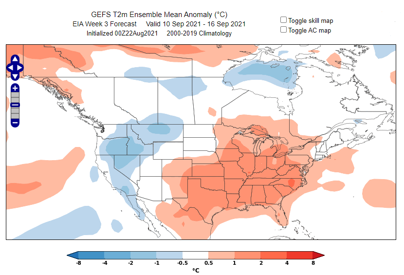
In Figure 4 we see an ensemble forecast can be represented as an anomaly forecast map.
The same forecast can also be represented as a probability forecast map: Figure 5.
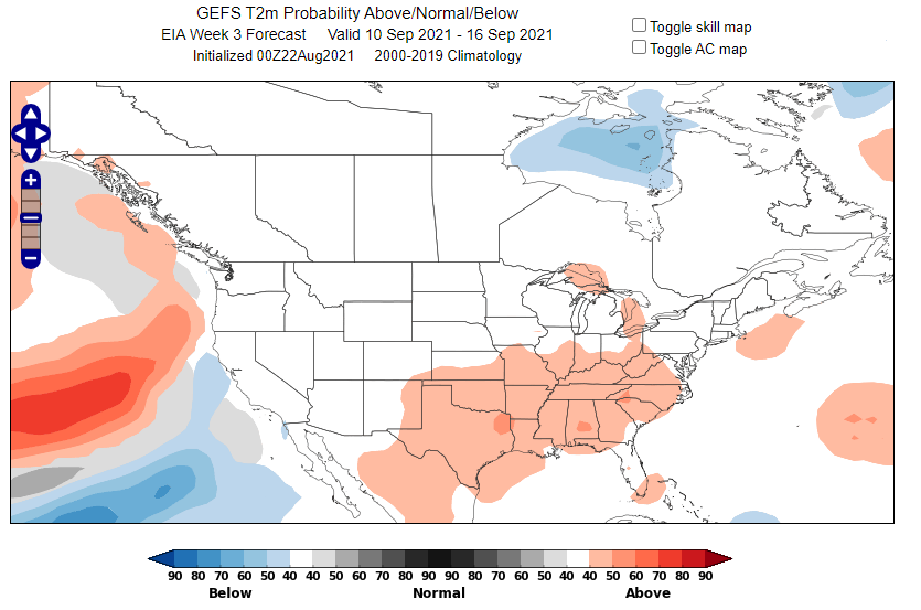
The maps look similar; in the anomaly forecast map, the Upper Midwest looks warm, and you might infer that it is bound to turn out warm. However, in the probability forecast map (Figure 5), we see that the Upper Midwest generally has a 30-40 percent chance to be above normal, which means there is also a 50-60 percent chance that temperatures will actually be either near normal or below normal.
Probability Forecast vs. Anomaly Forecast: Conclusion
Both anomaly forecast maps and probability forecast maps are useful, but it is important to understand the differences between them. Anomaly maps tell us precisely the average of all of the ensemble members but do not tell us about other outcomes and their likelihoods. Probability forecast maps tell us the likelihood of different events occurring in the form of probabilities of tercile events occurring, which is very powerful. The compromise is that the forecast is expressed as a range (tercile) rather than an exact value.